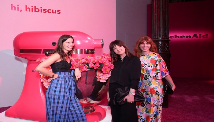
A behind the scenes look at how Hibiscus reflects society’s want of optimism
KitchenAid brand’s Color of the Year, Hibiscus, is vibrant, bold and lush. Designers at Whirlpool Corporation see it as a reflection of how society has overcome so many obstacles in recent years, even amongst themselves.
With the Color of the Year, the process starts years in advance. Brittni Pertijs, a Whirlpool Corp design manager focusing on color for the KitchenAid brand, and her team work with other functions across he company, including the brand and consumer insights teams, to analyze socio-cultural and aesthetic trends from around the world.
But Hibiscus was developed during the height of the pandemic, when the brand’s designers had to find a new way to collaborate now that they were working exclusively from home and were away from their studios and each other.
Pertijs says, “Normally we are out in the world and we see things and we make connections together as a team. We realized this color had to be built around a strong story, and we knew it was important to design a color with a strong emotional connection as people began to want optimism and escapism because of what they’ve gone through.”
After a successful and warmly received launch for hibiscus, the team plans to connect future colors to a human sensation or emotion while continuing to celebrate nature within the home.
As early as 2017, the Pertijs and the KitchenAid team started tracking hot pink and saturated red shades, seeing it pop up in fashion and interiors. The team drew inspiration from global fashion and interior trends from the 1970s.
“We were inspired by that era. Seeing soft curves, furniture, funky shades, playfulness and fun,” added Pertijs. “People want to have fun in their interiors and that’s what we wanted to bring through in this color. Hibiscus is for having fun and expressing yourself, your style, and bringing joy into your home.”
Pertijs continues, acknowledging hibiscus is great for those with an eclectic or maximalist style who want their home design to speak to their mutli-faceted interests.
- Quick design tips for inspiration around Hibiscus:
- Use muted greens as the backdrop to make Hibiscus the statement.
- Have fun with contrasting colors like cobalt blues to make it pop.
- Hibiscus fits very well in a modern or a transitional kitchen.
Source: Whirpool